Visualization of Hamlet

I used wordle to create a visualization of the Shakespearian play, “Hamlet,” using the digital version from Project Gutenberg. Other than “Ham,” which is the abbreviation for Hamlet that signifies when he is speaking, the largest, most commonly used words are “lord,” “king,” and “queen.” These words of political position reveal not only the main characters in the play, but also the nature of the conflict and the power struggle within the play between Hamlet, and his uncle, King Claudius. Some other heavily recurring words include “good,” “well,” “soul” and “heaven” which also demonstrates Hamlet’s own inner conflicts of his desire for revenge and his fear of going to hell. “Speak,” “think,” and “now” further demonstrate his indecisiveness as he puts off his revenge as time continues to run out. Shakespeare also examines human “nature” and one’s “fear” or acceptance of “death” throughout the play. While this is an accurate representation of underlying themes and motifs within “Hamlet” and roughly outlines the plot, it does not explicitly show that Hamlet wants to avenge his father’s death by killing Claudius. However, it does a good job reflecting the overall mood, as well as the significant aspects that one would not necessarily collect from reading a summary. I believe this visualization is an accurate representation of the play.

One tool that would be useful for distant reading, besides a sort of family tree, which already exists, would be a mapping of the characters and their place in time. Since it is a play, it would be interesting to see the position of the characters on the stage, and which direction they are facing. The interface could be just a giant rectangle (like a stage) and the characters could come in an out of the stage, represented by their names or how they appear in the play. The direction the words are facing can represent the way the characters turn or behave.

Candidate Comparison

To compare the two presidential candidates’ views and plans regarding the issue of women in the workforce, I inserted their answers to the question posed in the second debate:

In what new ways to you intend to rectify the inequalities in the workplace, specifically regarding females making only 72 percent of what their male counterparts earn?


I included only the first time each candidate spoke about the issue and edited the stopwords to get the most accurate picture.

Governor Romney:

This image shows that the economy was mentioned more than any other word (except women, which he was obviously talking about). There are also many words relating to the economy, such as “jobs” and “work”, but some of the words are a bit questionable. He seems to be focused on the economy as the number one problem for women today, and not just any women, but mothers. Words like “kids” and “flexible” suggest that he believes that the women in the work force are the primary caretakers of their children and they need more flexible work hours than men do in order to function in the economy. From a feminist’s point of view, this word map looks pretty bleak. However, from the point of view of someone unaffected by this issue, it may look promising. More people today are concerned about the American economy than the American women.

President Obama:

This image suggests that Obama is most concerned about the people. Although some words relating to the economy are mentioned, the focus is on the people. The biggest word in the image is “we’ve”, which the president uses frequently to stress what we as a country need to do to fix this “issue” (another frequently used word). “College” and “education” are his proposed solutions for the “young” “women” who are soon to enter the working world. From a feminist’s point of view, this looks pretty darn good. One might even say that our president is…

http://www.quickmeme.com/meme/3rh1ao/

^^ I made that I swear! I just can’t figure out how to make it work….

actually who else would make such an awful meme? I’m sure you believe me.

A Distant Reading of Lucky’s Speech from “Waiting for Godot”

For this week’s blog post, I selected a short excerpt from one of my favorite plays, Waiting for Godot by Samuel Beckett. The passage I chose is taken from Act 1, wherein a character named Lucky is asked to think for the  entertainment of three other characters; the resulting gibberish is arguably one of the strangest and most difficult to understand monologues in recorded history, right on par with the famous internet phrase “Has anyone really been far even as decided to use even go want to do look more like?”.
Wordle: Lucky's Speech from Waiting for Godot

I used Wordle to create a word cloud using the entirety of Lucky’s monologue. When analyzed, I feel that this visualization accurately conveys the surrealism and bizarre nature of the passage. Some of the largest words are “reasons”, “unknown”, “skull”, and “tennis”. It was sounding pretty existential and deep right up to tennis, right? If you look closer, one can see proper nouns, such as, “Connemara”, “Testew”, and “Cunard”; I have no clue what these are in reference to, both in the context of the play and the visualization. This is an example of why I feel this visualization is so successful. One thing that this visualization fails in is the fact that common words such as “the” and “and” are omitted. I acknowledge that I made the choice to omit these words, so as to see the subjects of the speech; however, in omitting the common words, one loses the style of the passage, which is littered with excessive iterations of “the” and “and” (“the” alone is used 73 times in the 700 word passage!).

Overall, I would assert that this distant reading visualization succeeds more than it fails in creating an accurate representation of the passage I chose to analyze. I feel that a visualization tool that created a word cloud that simultaneously gave demonstration of the style would be very useful for texts such as the one I chose, if it existed.

Visualizations

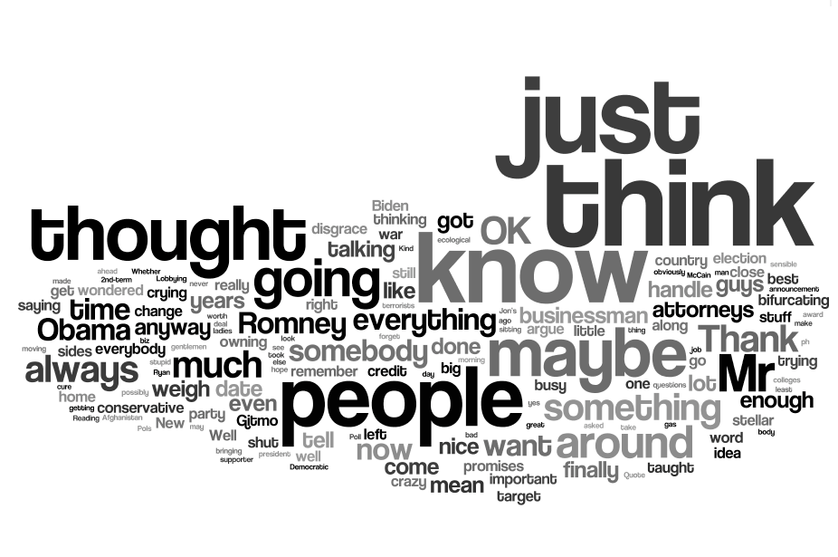
Think. Thought. Just. Know. Maybe. People.

These were the heaviest used words in Clint Eastwood’s speech to the Republican National Convention on Aug. 30 – the same night that Republican presidential nominee Mitt Romney would later speak.

Eastwood’s speech is now known for him lecturing an invisible President Obama, represented by an empty chair, which has spawned an entire meme culture based around “invisible Obama” and the metaphor of emptiness. It is also known for being hardly coherent but wholly hilarious.

The distant reading in fact proves Eastwood’s spontaneity and ambiguity, and possible confusion. The most used words are vague contradictions – “think” and “know,” for example, go against each other as opposing definitive forms. He also used the word “maybe” several times, also hinting toward lack of clarity and further confusion.

None of these words are at all complex. In fact, many of them would probably be in an eight-year-old’s vocabulary – save “bifurcating,” which may have come out of left field. This shows either unpreparedness, a lack of comfort when speaking in front of large crowds (though since Eastwood is in the movie business, that may not be the case) or a simple state of confusion.

However, this distant reading doesn’t even hint to the hilarity within the context of the speech. It is just funnier reading the transcript with the broken phrases, the dashes, the self-interruptions, or watching the video where he actually lectures the empty chair. The distant reading also doesn’t provide the context: the RNC, on a night after hurricanes throughout the south and just minutes before the highly anticipated speech from the nominee is due to happen. The distant reading misses out on this muddled speech in the context of the high-tension situation.

I wish there was a new distant reading tool in situations where the text is also on video (such as a speech, a reading or a monologue from a movie) that could piece together screenshots of the speaker or the scene and match it to each word used. For example, every time Eastwood said “maybe,” scrolling over the word on the visualization could bring up a series of screenshots from the video of the speech, which would be all the times in the speech that he said the word “maybe” and would have his facial expression when saying it. Or, better yet, if there was a video software that could recognize individual words in speeches and piece them together, so for the word “maybe,” you would have also a video of Eastwood saying “maybe” each time in his speech (just one-word videos all pieced together in chronological order).

For pieces of text that are not video format, it would still be nice to have the contextual element as part of the visualization. For long pieces of text, perhaps words could be linked to a list of settings where the word was said to give a better picture of why the author chose to use that word at a certain time, and give the reader insight into context, which is – as seen in the visualization of the Eastwood speech – a very important component of storytelling.

Everybody’s favorite Wisconsin vice presidential candidate talks at the convention.

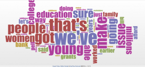
I also visualized Paul Ryan’s RNC speech, out of curiosity. The distant reading visualization is of Paul Ryan’s speech to the Republican National Convention on Aug. 29, 2012. Ryan spoke in a highly anticipated speech to the convention crowd the night before Romney was slated to speak at the convention. This is a convention that “competed” for national attention with hurricanes and storms in the southern part of the country, and was viewed on some news channels in a split-screen format – a move by the media that was criticized by many.

The visualization suggests that Paul Ryan’s speech wasn’t out of the ordinary in that of his typical political counterparts, using words such as “president,” “Romney” and “Obama,” but also “life” and “country,” signifying his speech was personal, as well.

My extra credit relates to the second Wordle I did about Paul Ryan’s RNC speech and looks into the Paul Ryan Gosling meme. http://www.youtube.com/watch?v=fJfMEiVGl6M

Visualizing Homestuck

I created a visualization of the text of the first four acts of Homestuck, an online multimedia  webcomic about four kids who must play a very unusual game to preserve reality itself. The four kids–John, Rose, Dave, and Jade–appear prominently in the Wordle, but far larger are their chatroom handles (EB, TT, TG, GG), because all dialogue takes place as online chats, or pesterlogs (a word that is decently sized in the graphic as well), and those handles preface every line of dialogue. While John’s name is the largest of the kids’ names, because he is the main focus of the story and is thus mentioned most in narration,  Dave’s handle (TG) is clearly the largest word in the graphic, indicating that he talks the most out of the whole cast.

The rest of the Wordle indicates that the story is mostly dialogue with the predominance of conversational words such as “like” and “yeah.” The graphic hints at the subject of time travel, a main focus in the story, with the words “future,” “now,” and “time.” Other words related to important plot points–”house,” “package,” and “card.” However, the Wordle does not suggest any overall themes or subjects for the work. This is probably the result of the story being almost entirely dialogue, and thus subject more to the characters’ patterns of speech than a single narrative pattern emphasizing clear themes. Also, the text I entered was only the first four acts (there are six in all, with three intermissions).

The only new feature for this visualization tool that I could think to ask for would be perhaps some way of seeing how different words are connected, like clicking on a word and showing which words often show up near it. This might outline thematic connections more clearly, and help focus on meaningful words without having to delete the extraneous ones (which distorts the graphic).

Iliad Text Analysis

The Iliad is generally known as the story detailing a portion of the Trojan war. Everyone knows the story of the arrow shot into the heel of the otherwise invincible Achilles. What comes to the minds of most is the bloodshed, glory, and general concepts associated with large scale warfare.

This excerpt from Book I of the Iliad, however, paints a different story than the condensed version typically portrayed to the Cliffnotes reader. For those more aware of ancient Greek culture as well as the social function of the Iliad at the time, it becomes apparent that these selected words reveal the truer message of the Iliad–more than the violence most people remember.

Note the high concentration of personal pronouns, as well as names of gods and high profile characters. This is more than your ordinary utilization of names. A great deal of the story revolves around individual possession and rank. While the story itself details large scale warfare, the heart of the Iliad’s message revolves around individual conduct, and the expected code of behavior. It is understandable why gods and heroes, the paragons of these qualities, would comprise the second most recurring words in these categories.

While the language is not that of the original text, the message remains the same. Words like “with,” “my,” “that,” “son,” and “have,” show that the Iliad was not the story of the battle, but of the individual–detailing not war, but the relations between men. 

The Greatest Speech Ever Made

I decided to create a distant reading visualization using the text of Charlie Chaplin’s “Greatest Speech Ever Made,” delivered, with the protagonist dressed as Hitler, at the end of his classic film, The Great Dictator. I was fascinated to discover that — despite somewhat extensive tweaking — the final product appeared to embody the very things it purportedly railed against. Chaplin’s speech is a takedown of machinery and automated intelligence, advocating for the reinvigoration of compassion into modernized societies  Yet, the largest words were: men, hate, people, world, power — the very things the speech criticized.

In that sense, the visualizations outlined the problems in the world just as effectively as Chaplin’s rhetoric, but does not sufficiently account for the solutions, clearly mentioned less frequently over the course of the speech. It was important to me that the visualization featured literal shades of gray, in order to illustrate the binary Chaplin seeks to distance himself from in the speech. Still, given the style of the film itself, true color seemed to be inappropriate to me. All in all, given the dramatic emphasis of the concepts the speech clearly identifies as undesirable the visualization did not strike me as accurate, despite the manner with which it informs elements of Chaplin’s argument.

I would have loved a visualization tool that let me move words around so as to contextualize the words. For example, Chaplin constantly affirms that x is needed more than why (“more than machinery  we need humanity, more than cleverness, we need kindness and gentleness”). I think that redistributing the words within that framework would have served an enormously constructive purpose in terms of telling Chaplin’s story in fewer words. I think the use of objects and shapes, in addition to words, would have added to the images. There is almost a chart-like nature to the way the speech is delivered (“men who despite you, enslave you, who regiment your lives”), so adding lines and boxes would allow for adjectives to be more easily matched with their respective nouns, enhancing the narrative of the image. In terms of animation  it would be extremely cool for the adjectives to shuffle and then be replace with their positive alternatives (“dont fight for slavery,” becomes “fight for liberty,” with the key words dancing in and out, matching up with other phrases to convey the terminological dance of the speech). 


Visualization of Adele Lyrics

Wordle: Adele Lyrics

For my visualization, I made of Wordle using Adele lyrics. This Wordle is comprised of the lyrics of her five most recent chart-topping songs: “Someone Like You,” “Rollin’ in the Deep,” “Turning Tables,” “Rumor Has It,” and “Set Fire to the Rain.” It is well known that Adele sings about her struggles in love and the good and bad times in her relationships. I wanted this visualization to show how many of her songs are connected.

This image highlights the major themes linking her songs. The three biggest words in the image are, in order from left to right, “Never,” “gonna,” “love.” It is almost like the Wordle is uncovering the secret message in her lyrics—Adele is doomed to live life loveless and just keep creating songs about it.

If we isolate each one of the words though, we find different meanings. The word “never” is the biggest and most prevalent. That sets tone for the overall image: negative and depressed. It shows that Adele almost always sings about incidents she thinks or knows will never happen or have never happened. When contrasted with the other prominent words, it highlights that this negativity is based on her love life.

The word “gonna” is the next biggest. Because “gonna” ambiguously refers to the future, it is possible that the word could be used in either a negative or a positive context. It does suggest, however, that most of what Adele sings about is events that have not occurred yet.

The third most prominent word, “love,” suggests one thing: this woman like to write love songs. Most are about heartache, heartbreak, and despair, while a few others are about optimism. Regardless, it can be concluded that almost every one of Adele’s songs is about love.

Some other words that stand out are “time,” “wish,” “heart,” “deep,” “turning,” and  “sometimes.” All of these words sound like they are coming from a hopeless romantic. To anyone familiar with Adele, the overall theme of these words would immediately give away the origins of the texts in this Wordle.

To someone unfamiliar with Adele, this visualization is a wonderful way to sum up the basic message of every single one of her songs: Never gonna love.

A lot of people claim to connect with Adele’s lyrics. It would give her words even more meaning if there were a visualization tool to see which words that she used were most stronglt felt or agreed with by her fans. Each person connecting with the word could be represented by a glowing dot. The dots will then surround the words, thereby illuminateing the words that are most popular, or rather, more universally felt. This would not only show how Adele’s word choice allows her to connect with her audience, but also how the audience connects with each other. The genral ideas about love and loss can be presented in a universal depiction.

Distant Reading Visualization of Doctor Who

I chose to create a distant reading visualization of quotes from the Doctor Who episode “The Christmas Invasion” using the IMDB quotes page. Here is my pic:

Wordle: Doctor Who - The Christmas Invasion

Obviously, “doctor” is the most important word; it is Doctor Who after all. But the interesting thing about this picture, is that since it is made from quotes and the format for quotes is “(person speaking): (what they say),” you can’t tell if the word “doctor” is the most used because he is the one most often speaking, or because he is the most often referred to by other people. Or it might be a combination of these. Or, it may because some quotes are repeated, incorrect, use stage directions, or are interpreted differently by different people. There is so much variety, that this picture tells us more about the quotes page itself, than the actual Doctor Who episode.

As far as coming up with a new distant reading tool, I’m not particularly creative, so it’s likely someone has come up with this before, but here goes: a 3D model of a page of words, with the words at different heights. The different heights of the words could mean the amount of times the word is repeated, the significance of the word (left up to the artist’s interpretation), the number of letters in the word, the number of syllables, the number of different letters in the word, etc. The list goes on and on. I know this is a very general idea, but I think flexibility is good for this kind of thing. It means many people can use this tool to demonstrate different things about a piece. And 3D stuff is cool.

Visualization of “Fire Story”

http://www.wordle.net/show/wrdl/5901658/Fire_Story

I decided to create a Wordle of the story I wrote for our week two homework assignments. This Wordle represents the story well. The largest words that appear on the Wordle are Fire, Suit, and Laura. These words accurately represent the main focus of the story which was about a girl named Laura and a fire suit.

The next largest words are started, observation, chamber, demonstration, and window. At first glance these words are difficult to interpret but after reading the story it is clear why they are frequent. The story is centered on testing a fire suit in a chamber for a demonstration which is observed through a window. Another word that appears large is bar. This word seems more random and harder to connect to the other large words. I even had to think about the connection for a moment before I remembered how a metal bar was crucial at one point in the story. In this case the Wordle actually revealed the significance of an object in the story that even I, the author, was not fully aware of.

Some of the much smaller words such as crash, smashed, panic, and screaming suggest that the story has some form of action or drama. This is an accurate portrayal of the overall tone of the story because it is very much centered on action and drama. Not all of the small words were this easy to interpret. The small words such as red, members, research, music and cold seem different and cannot be used to make a fast generalization about the story.

An improvement to a distant reading tool I would suggest would be the addition of a time element. If a program, like Wordle, could categorize the most frequently used words with respect to the time in the story, this would add great insight. With this visualization we could easily discover the differences between the beginning, middle, and end of a story.